At Moneyworks we attend many (many) presentations about what is happening in the world and the economy and our fund managers outlook on the world.
As we outline to you in our 'fund manager focus' at the annual review this year, all active fund managers are continually looking at what is happening in the world (inflation, employment, interest rates, megatrends like cyber security, climate change, demographics) to work out where the world is going and how that will impact on the investments that they hold.
I found some of the graphs at a recent conference fascinating, and thought that as a one off, I would share some with you (with a brief explanation). I have put the explanation below the graph.
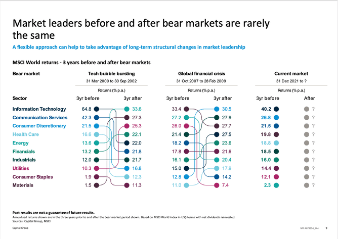
Which industry is going to lead in the next bull market?
This complicated table is worth spending some time to analyse. What this shows on the left hand side is which sector was a leader in the 3 years before a bear market and 3 years after (thanks to Capital).
Take some time to work your way through it. The main things to note are:
Information Technology led in the 3 years before the 2000 tech bubble burst, but fell to 5th in the 3 years after. But, it also led in the Global Financial Crisis (fell to number 3 after) AND in the 3 years up to this bear market. However, the actual companies that led in each occasion were different to the actual companies in the next bull market.
Materials jumped from last before the 2000 tech bubble burst to 2nd after, but only from last before the the GFC to 8th after. Still last going into this market correction.
You can do the tracking of the rest of yourself, but the important thing is, 'choosing leaders and winning shares is not easy. It takes a lot of analysis, research and work', which is why at Moneyworks we spend a lot of time understanding why and how our fund managers approach their work.
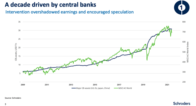
Investments increasing in value have a close correlation to the amount of money central banks have put into the economies
This is a closely co-related chart between the world share index (MSCI AC World) and the Amount of Central Bank Assets. Thanks to Schroders for this one.
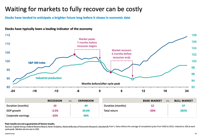
Waiting for markets to fully recover can be costly
Another Capital Graph, which is pretty self explanatory - the key information is in the red bits.
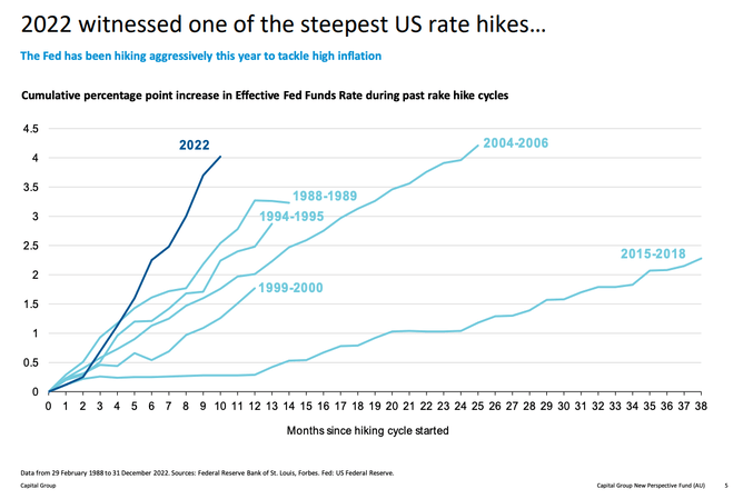
2022 witnessed one of the steepest US rate hikes
The picture tells the story. The rate hikes are to get inflation under control - inflation that exists for multiple reasons including a. Post Covid mismatches of Supply and Demand b. Supply Chain issues with ships and containers being in the wrong locations for a long time c. Pressures on housing costs around the world (including rental d. Pressures on energy costs (post Ukraine invasion) e. Pressures on food costs (post Ukraine invasion and climate related droughts and floods) f. Pressure on labour supply (related to immigration flows and a changed view of what kind of work they want to do, from a number of people).
Thanks again to Capital

